
The facias of shops are a great part of the character of our town. Yet we have the horrors of Shoe Zone (soon to become Joules clothing I hear). Hope House has a new facia that promotes the shop well but does nothing for the character of King Street. Now Crew Clothing wants a really horrid makeover.
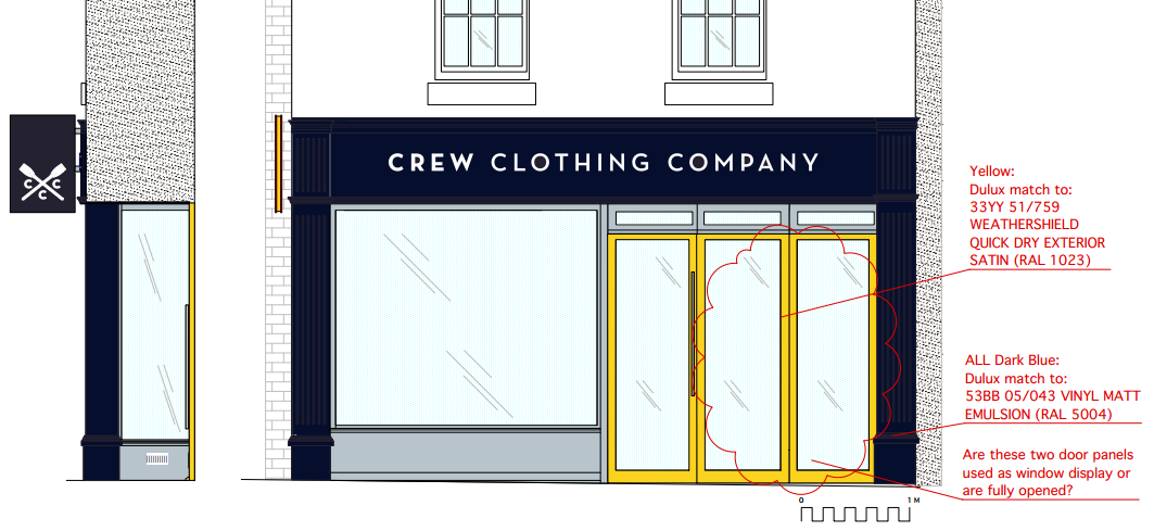
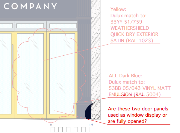
The shop front will be black poisoned with yellow. I don’t like it and the makeover does nothing for Ludlow. (Note: I have been corrected in the comments below. It is very dark blue. That doesn’t change my opinion that this is out of place in King Street.)
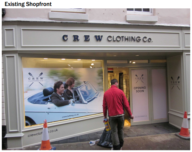
Crew Clothing looks like this now

This is the Crew Clothing corporate image

And this is what the King Street store could look like
Frankly this design is perfectly horrid. I wonder if the designers have ever visited Ludlow. I rather suspect they drew up this scheme on a computer somewhere a long way from our town. That is presumably why the designers don’t know whether the all the doors of Crew Clothing open or not. They admit this in the detail below.
Whether you are a local trader or an international chain, it must be recognised that Ludlow is not like anywhere else. It is the duty of everyone who live and works in this town to protect its historic character. That includes national chains that want to trade in our town.
I will have made a formal objection to this application for listed building consent (16/02226/LBC). I said:
This is horrid scheme will do nothing for the character of the historic town centre of Ludlow. It is nothing other than a corporate makeover based on a colour scheme that works in loud, brash town centres where brands need to shout to be noticed.
The current, muted colour scheme for Crew Clothing works well in our quiet town. The proposed black and yellow scheme is foreign to the landscape of King Street.
All developments and makeovers in the Ludlow conservation area should aim to improve the character of the streetscape. This development will degrade the historic character of King Street.
It should be refused.
I prefer the existing shop front but won’t lose sleep if it is changed. Far more offensive are the garish fronts of the two betting shops in the centre of town – and there very existence is even more worrying in a small town.
SORRY, SORRY SORRY – “their” not “there”
The black & yellow colour combination is often employed in nature as a warning (e.g. yellow-banded poison dart frog). Perhaps Crew Clothing is conducting a bizarre experiment to reduce footfall?
The shop front will be Navy Blue poisoned with yellow, not black poisoned with yellow.
Yes it is a corporate makeover, one that is designed to make it stand out from all the other beige shops. But then not all the other shops are beige; shoe zone-electric blue, Timpsons-burgundy, Vaughans-green, Costa-Burgundy.
Crew Clothing are in major cities but also in market and coastal towns like Ludlow.
Personally, I’m not keen on the yellow, but it’s not my choice, I just work there!!
Please feel free to come in and talk to us though Mr Boddington.
Thanks for the comment and correction. Being dark blue – very dark – doesn’t change my opinion. The fact that some other shops are garish – Shoe Zone is vile – doesn’t give us the right the make a similar mess of a Grade II listed building in a conservation area. Planning and heritage policy urges us to seek improvements when changes are made. In my view, Crew Clothing’s makeover detracts from the historic streetscape rather than improve it.
What about the garish yellow tudor building on Broad Street “poisoned” with black beams? Surely by your standards this property should be repainted to be more in keeping with the town’s aesthetic.
Great improvement – reinstating the original frontage and street line. Those awful slanted shop-fronts – relics of the ’60s – are so out of place on historic buildings. As for the colour scheme – great to see diversity. And that yellow – so vibrant; effusing energy. Look at the shop fronts of Galway. An explosion of colour. None of this morbid obsession with the ‘neutral’ tones of Farrow & Ball.
http://www.alamy.com/stock-photo-colourful-galway-shops-a-row-of-colourfully-painted-shops-in-galway-25949425.html
Leaving aside colours for a moment, have Crew Clothing looked carefully at the measurements of the average Ludlow customer?
If not, they may not be in King Street so very long.
Shoezone may look vile but local people are very annoyed that it is going!