
A small dip in infection rates across the Shropshire unitary area suggests we are not heading for tier 2. The situation is not so comfortable in Telford and Wrekin where the seven day infection rate remains stubbornly above 100, averaging around 160 during the last week. The biggest jump in cases is centred around Harper Adams University west of Newport. There the seven day infection rate has been above 900. That compares with areas in Liverpool now in Tier 3 lockdown.
There is little change for Ludlow which still has a low level of cases.


We should be concerned and we should be careful. But the data for Telford and Wrekin doesn’t mean it must go up from Tier 1 to Tier 2. Decisions on changes to tier status are bespoke. In Telford’s case, the real issue is the Harper Adams cluster. In the rest of the borough, the seven day infection rate is around 125. That’s above the reputed threshold of 100 for Tier 2 but infection is not out of control across the town.
The next couple of weeks will be critical for both Telford and Shropshire councils. School half term will introduce different social mixing. There will be more time indoors unless the weather forecast improves. Separated couples will exchange children. Both councils have a good chance of avoiding Tier 2 designation. We don’t want Tier 2. It would prevent households mixing indoors. It could prevent grandparents looking after their children’s children. The afterwork drink with colleagues will be banned. Going out for dinner with friends out of order. But we are not there yet.
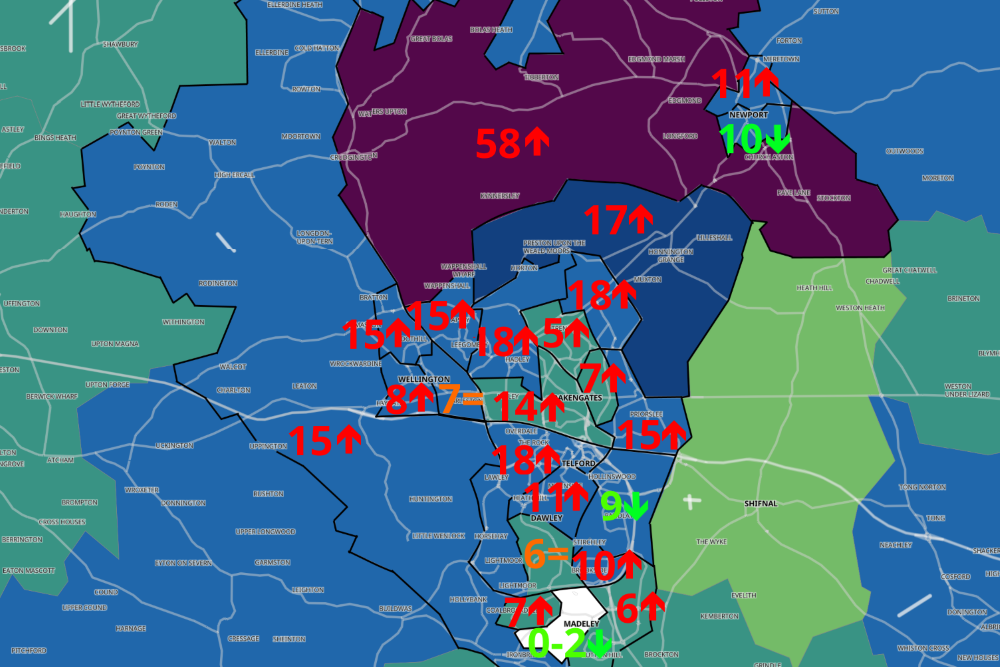
This is a story told in images rather than words. The arrows on the maps below indicate whether cases are going up compared to the previous seven day period. The number is the most recent count of cases. Up arrow shows cases going up, the equals sign indicates no change.


The bar charts in this article are up to date to 24 October. The most recent days are subject to revision as the government cleans up the data. The maps are to 18 October, reflecting the five day lag in government provided data at local level. The awkward shaped areas on the maps are middle super output areas (MSOAs) – a standard geographical unit for demographic studies. Awkward but useful.